
Pantone Color of the Year for 2021, in the news, featured here in our Texas Lifestyle Design Series. Sharing news and events celebrating culture through interior design from Texas and around the world.
Please find out more about Texini, the leading Texas lifestyle brand defined by its celebration of the Lone Star State’s culture, heritage, and values.
Read more about color here.
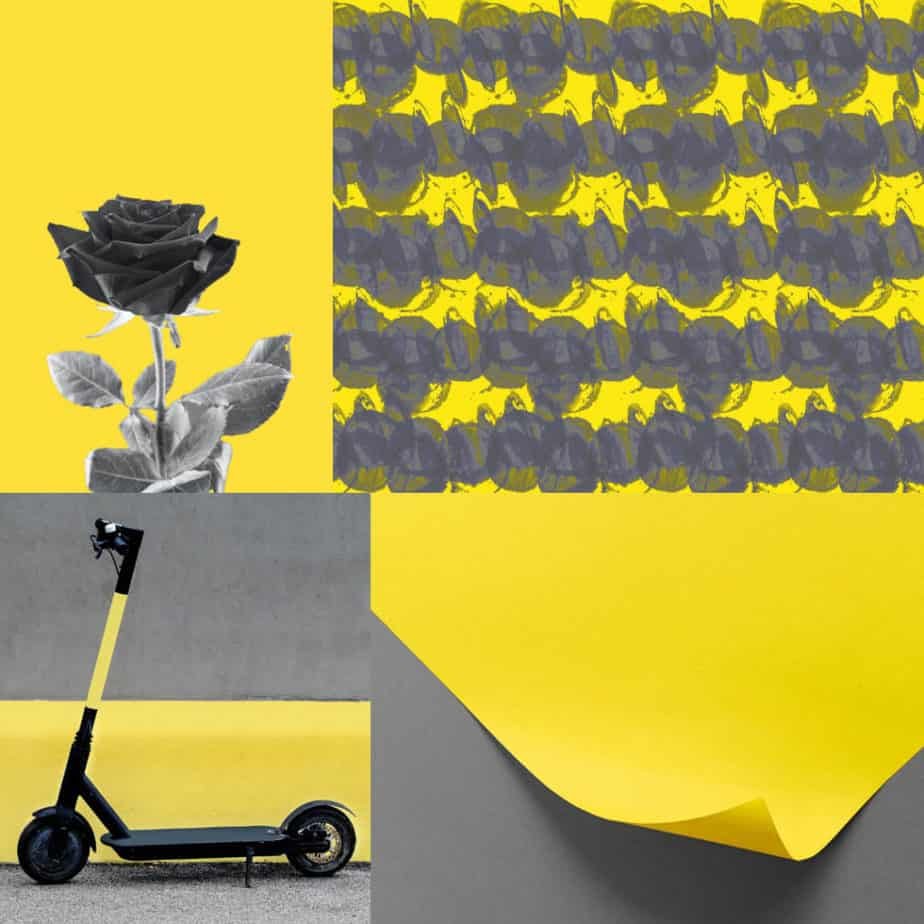
CARLSTADT, N.J – December 9, 2020 – Pantone, the global color authority and provider of professional color language standards and digital solutions for the design community, today announced PANTONE 17-5104 Ultimate Gray and PANTONE 13-0647 Illuminating, as the Pantone® Color of the Year selection for 2021, two independent colors that come together to create an aspirational color pairing, conjoining deeper feelings of thoughtfulness with the optimistic promise of a sunshine-filled day.
Retrieved from https://www.pantone.com/articles/press-releases
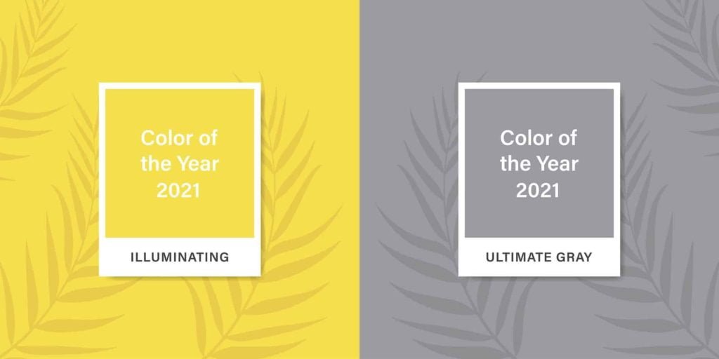
PANTONE REVEALS COLOR OF THE YEAR 2021: PANTONE® 17-5104 ULTIMATE GRAY AND PANTONE 13-0647 ILLUMINATING
A MARRIAGE OF COLOR CONVEYING A MESSAGE OF STRENGTH AND HOPEFULNESS THAT IS BOTH ENDURING AND UPLIFTING.
CARLSTADT, N.J – December 9, 2020 – Pantone, the global color authority and provider of professional color language standards and digital solutions for the design community, today announced PANTONE 17-5104 Ultimate Gray and PANTONE 13-0647 Illuminating, as the Pantone® Color of the Year selection for 2021, two independent colors that come together to create an aspirational color pairing, conjoining deeper feelings of thoughtfulness with the optimistic promise of a sunshine-filled day.
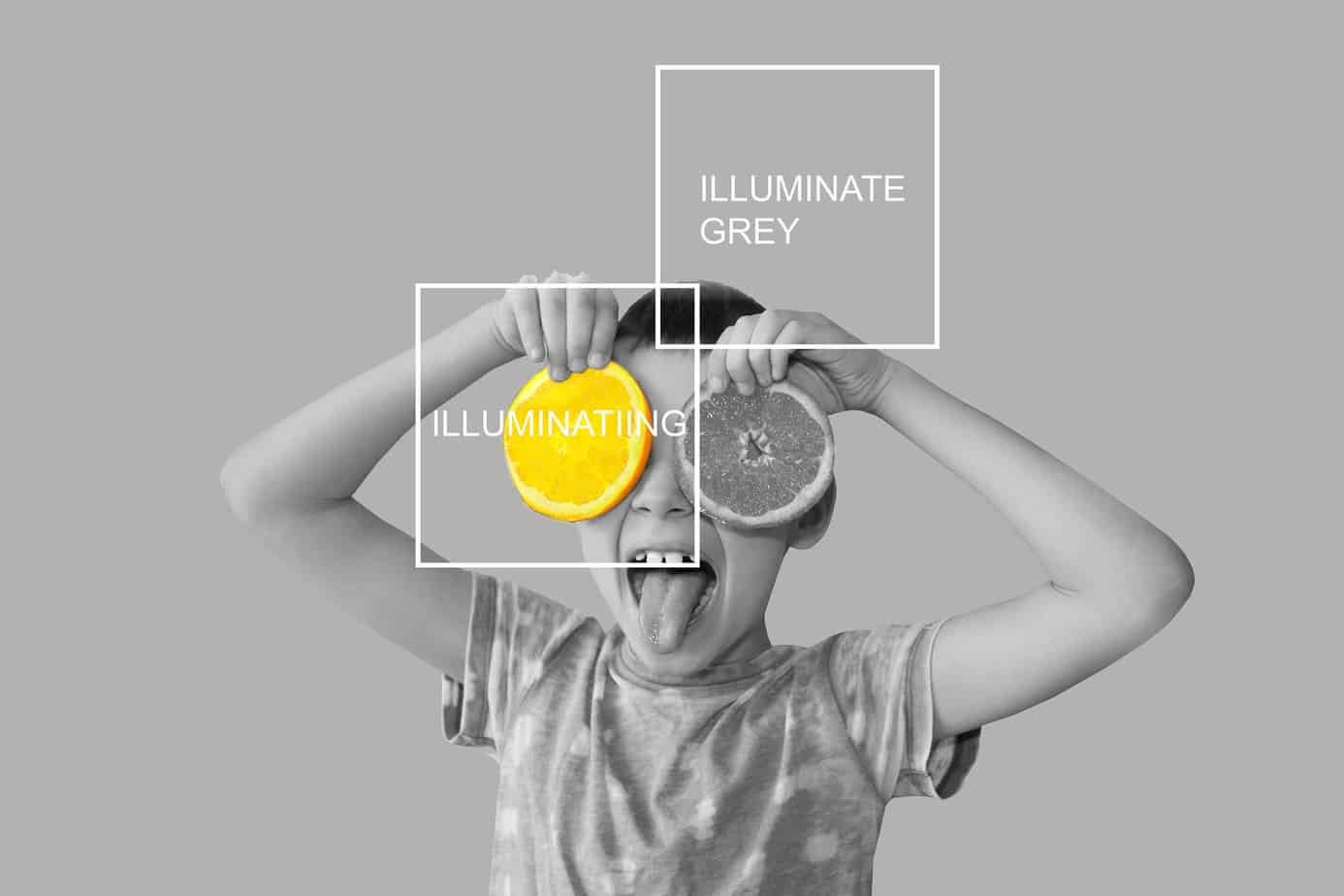
As people look for ways to fortify themselves with energy, clarity, and hope to overcome the continuing uncertainty, spirited and emboldening shades satisfy our quest for vitality. Illuminating is a bright and cheerful yellow sparkling with vivacity, a warming yellow shade imbued with solar power. Ultimate Gray is emblematic of solid and dependable elements which are everlasting and provide a firm foundation. The colors of pebbles on the beach and natural elements whose weathered appearance highlights an ability to stand the test of time, Ultimate Gray quietly assures, encouraging feelings of composure, steadiness, and resilience.
“The selection of two independent colors highlights how different elements come together to express a message of strength and hopefulness that is both enduring and uplifting, conveying the idea that it’s not about one color or one person, it’s about more than one. The union of an enduring Ultimate Gray with the vibrant yellow Illuminating expresses a message of positivity supported by fortitude,” said Leatrice Eiseman, Executive Director of the Pantone Color Institute. “Practical and rock-solid but at the same time warming and optimistic, this is a color combination that gives us resilience and hope. We need to feel encouraged and uplifted, this is essential to the human spirit.”
“The Pantone Color of the Year reflects what is taking place in our global culture, expressing what people are looking for that color can hope to answer,” added Laurie Pressman, Vice President of the Pantone Color Institute. “As society continues to recognize color as a critical form of communication, and a way to symbolize thoughts and ideas, many designers and brands are embracing the language of color to engage and connect.”
Usage
A marriage of strength and optimism, Ultimate Gray and Illuminating do not have to be used in equal proportions, either color can take precedence whether for apparel, beauty, home furnishings, product design or packaging.
Ultimate Gray and Illuminating in Apparel and Fashion Accessories
Illuminating punctuated by a touch of Ultimate Gray conveys a message of sunshine and strength. Enduring Ultimate Gray provides a great bouncing-off point with Illuminating bringing in some brightness by way of a scarf, footwear, handbag, shawl, and tops. With its energetic presence, the marriage of Ultimate Gray and Illuminating is a great combination for activewear. The high visibility contrast of Illuminating and Ultimate Gray adds to its appeal for outerwear.
Ultimate Gray and Illuminating in Beauty
A mix of warm and cool tones, combining Ultimate Gray and Illuminating makes a dramatic statement. Illuminating sparkles and shimmers when paired with Ultimate Gray in eye make-up.
Ultimate Gray and Illuminating in Home Decor
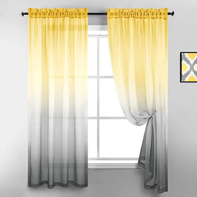
Ultimate Gray and Illuminating are a great combination to set the mood in any room in the home adding a dose of sunshine and positivity. Juxtaposing Illuminating with Ultimate Gray in table linens, sheeting and home accessories including pillows and tabletop infuse vitality and liveliness. Painting a front door in bright yellow Illuminating conveys a warm and welcoming message when supported by solid and dependable Ultimate Gray in the exterior finishes. The ideal combination for any office whether in the home or in a commercial space with Ultimate Gray provides the firm foundation for Illuminating, a vibrant yellow that heightens awareness and enhances intuition, lighting the way to intellectual curiosity, originality, and resourcefulness of an open mind.
Ultimate Gray and Illuminating in Packaging and Multi-Media Design
Pairing Illuminating, the color of highest visibility and reflectivity with resilient Ultimate Gray produces a visually noticeable message no matter where it appears. The coupling of friendly Illuminating with quietly assuring Ultimate Gray infuses a message of vitality into a firm foundation of reliability, wisdom, and experience for packaging and multi-media design.
Design with Ultimate Gray and Illuminating
Ultimate Gray and Illuminating are paired with versatile hues in a series of five palettes, available to designers as inspiration to incorporate into designs via the Pantone Connect digital color platform. Pantone Connect is available on mobile app and web, and as an extension app for Adobe® Creative Cloud® to make capturing, curating, and designing with Pantone Color easy and accessible. A featured Color of the Year page has all relevant color information for using Ultimate Gray and Illuminating across various physical and digital design media. Visit Pantone.com/connect.
Get this look today, shop here.
ADOBE X PANTONE
Pantone has partnered with Adobe Stock to offer a handpicked Color of the Year collection of imagery to inspire creators and bring color to life. Ultimate Gray and Illuminating, Pantone’s choice for 2021, two independent colors that highlight how different elements come together to express a message of strength and hopefulness that is both enduring and uplifting, conveying the idea that it’s not about one color or one person, it’s about more than one. With millions of visual assets, from still photography and design templates to fresh 3D and motion graphics, Adobe Stock is an endless resource for creatives seeking visual inspiration and essential design components. https://stock.adobe.com
See the Adobe Stock/ Pantone Ultimate Gray and Illuminating gallery here: https://adobe.ly/PantoneCoY2021
ARTECHOUSE X PANTONE COLOR OF THE YEAR
The nation’s first digital art destination, ARTECHOUSE creates innovative, one-of-a-kind technology-driven exhibitions and installations, across the United States. Their New York space, located in a 100-year-old boiler room in Chelsea Market will serve as the backdrop of our official Color of the Year 2021 digital announcement to media and influencers across design and creative industries. Inspired by the optimistic and enduring effects of PANTONE 17-5104 Ultimate Gray and PANTONE 13-0647 Illuminating, Pantone collaborated with ARTECHOUSE and their creative team to produce a visually compelling social media reveal. ARTECHOUSE will further immerse people in the colors through a unique augmented reality experience launching in 2021.
About the Pantone Color of the Year
The Color of the Year selection process requires thoughtful consideration and trend analysis. To arrive at the selection each year, Pantone’s color experts at the Pantone Color Institute comb the world looking for new color influences. This can include the entertainment industry and films in production, traveling art collections and new artists, fashion, all areas of design, popular travel destinations, as well as new lifestyles, playstyles, and socio-economic conditions. Influences may also stem from new technologies, materials, textures, and effects that impact color, relevant social media platforms, and even upcoming sporting events that capture worldwide attention. For 22 years, Pantone’s Color of the Year has influenced product development and purchasing decisions in multiple industries, including fashion, home furnishings, and industrial design, as well as product packaging and graphic design. Past selections include:
PANTONE 19-4052 Classic Blue (2020)
PANTONE 16-1546 Living Coral (2019)
PANTONE 18-3838 Ultra Violet (2018)
PANTONE 15-0343 Greenery (2017)
PANTONE 15-3919 Serenity and PANTONE 13-1520 Rose Quartz (2016)
PANTONE 18-1438 Marsala (2015)
PANTONE 18-3224 Radiant Orchid (2014)
PANTONE 17-5641 Emerald (2013)
PANTONE 17-1463 Tangerine Tango (2012)
PANTONE 18-2120 Honeysuckle (2011)
PANTONE 15-5519 Turquoise (2010)
PANTONE 14-0848 Mimosa (2009)
PANTONE 18-3943 Blue Iris (2008)
PANTONE 19-1557 Chili Pepper (2007)
PANTONE 13-1106 Sand Dollar (2006)
PANTONE 15-5217 Blue Turquoise (2005)
PANTONE 17-1456 Tigerlily (2004)
PANTONE 14-4811 Aqua Sky (2003)
PANTONE 19-1664 True Red (2002)
PANTONE 17-2031 Fuchsia Rose (2001)
PANTONE 15-4020 Cerulean (2000)
The color selected as our Pantone Color of the Year 2021 was taken from the Pantone Fashion, Home + Interiors Color System, the most widely used and recognized color standards system for fashion, textile, home, and interior design.
For more information please visit https://www.pantone.com.
About The Pantone Color Institute™
The Pantone Color Institute is the business unit within Pantone that highlights the top seasonal runway colors, selects the Pantone Color of the Year, forecasts global color trends, and advises companies on color for product and brand visual identity. Through seasonal trend forecasts, color psychology, and color consulting, the Pantone Color Institute partners with global brands to effectively leverage the power, psychology, and emotion of color in their design strategy.
About Pantone
Pantone provides the universal language of color that enables color-critical decisions through every stage of the workflow for brands and manufacturers. More than 10 million designers and producers around the world rely on Pantone products and services to help define, communicate and control color from inspiration to realization – leveraging advanced X-Rite technology to achieve color consistency across various materials and finishes for graphics, fashion, and product design. Pantone Standards feature digital and physical color specification and workflow tools. The Pantone Color Institute™ provides customized color standards, brand identity, and product color consulting as well as trend forecasting inclusive of Pantone Color of the Year, Fashion Runway Color Trend Reports, color psychology and more. Pantone B2B Licensing incorporates the Pantone Color System into different products and services, enabling licensees to communicate and reproduce certified Pantone values and improve efficiencies for their users. Pantone Lifestyle brings color and design together across apparel, home, and accessories. Learn more at http://www.pantone.com and connect with Pantone on Instagram, Facebook, Pinterest, and LinkedIn.
About X-Rite
Founded in 1958, X-Rite Incorporated is a global leader in the science and technology of color and appearance. With Pantone, X-Rite employs more than 800 people in 11 countries. The company’s corporate headquarters are located in Grand Rapids, Mich., with regional headquarters in Europe and Asia and service centers across Europe, the Middle East, Asia, and the Americas. X-Rite offers a full range of solutions used by manufacturers, retailers, printers, photographers, and graphic design houses to achieve precise management and communication of color and appearance throughout their processes. X-Rite products and services are recognized standards in the printing, packaging, photography, graphic design, video, automotive, paints, plastics, textiles, and medical industries. For further information, please visit www.xrite.com. For the latest news, and information, connect with X-Rite on LinkedIn, Twitter, and Facebook.
Contact: (718) 625 5843 | HugePantone@hugeinc.com.
More on interior design and the Psychology of Color here.
air fryer recipe areas in Texas areas of texas Austin Texas average cost of living in texas Bar-B-Cue Bar-B-Q Bar-B-Que barbecue barbeque bbq best cities in texas to raise a family best place to live in texas for families bowl of red budget-friendly meal cities in texas comfort food cost of living in texas easy appetizer easy dessert recipe easy dinner easy dinner recipe Easy recipe Foods in Texas friendly people google texas county google texas news google texas roadhouse gulf of america leading texas lifestyle brand lifestyle brand local texas one-pot meal party food protein-rich meal Southern comfort food Southern cuisine Southern dessert Texas texas cooking Texas Hill Country texas lifestyle brand Texas Panhandle Texini the leading Texas lifestyle brand weeknight dinner
Recent Posts
💜 Midnight Blackberry Squeeze Martini is 🌟bold, bright, and a little dangerous—just like a good crush.
San Antone Cowboy Coffee dressed up for a night out! Or just boot heels on the porch. Sunrise stretching, like a slow yawn over mesquite trees. And in your hand, not just coffee, but a cup with a...
